Categories
Design HCId Journalism

HCI Connect Podcast with Interview with yours truly

Tucked under warm blankets in below freezing Chicago weather on my birthday, I got on a video chat with two HCId students from my alma matter, Indiana University. I really enjoyed hearing about what they care about and want to know. Getting your career started can be hard and scary but I’m excited about how thoughtful and hungry the future of our design community
Listen here:  http://www.connecthcid.com/#nina-mehta

In this episode of ConnectCast, with Stephanie Poppe and Jordan Hayes. Poppe and Jordan speak with designer and visual artist Nina Mehta. Nina graduated from Indiana University’s HCI/d program in 2011 and currently works as a product designer at Pivotal Labs in San Francisco. In this segment, Nina discusses her graduate school experience, the challenges she faced as a young designer, her liberating foray into experience design through projection live visual art installations, her passion for social activism and the importance of creating real products for real people.


Categories
Design

If your product team were Chess pieces

The game of Chess is a Kingdom’s of strategy, problem solving and battle together in conquest. The pieces and tactics in the game of chess are not so different than those on a product team, just hopefully less bloodshed.

The Pieces

The King (♔, ♚) represents your Users.
They can move in any direction, but only one square at a time. Without them you have lost the game; you’re just moving pieces around on a board.

The Queen (♕,♛) is your CEO.
They can move in any direction, any number of squares. This player is most powerful, and can  easily transfer firepower and control the opposition.

The Rook (♖ ♜) is your Product Manager.
They have limitless horizontal and vertical movement. They can safely exert control of the board and have a special relationship with the King.

The Knight (♖ ♜) is your Developer.
They move in a two-step, one-step L shapes-shaped direction. Their power comes from jumping over pieces in closed positions especially early on.

The Bishop (♖ ♜) is your Designer.
They have limitless diagonal movement. They are underrated by beginners and gain strength as the board opens up with their power of influence.

The Pawn (♙♟) is Marketing.
They advance only forward a single square except twice in their first move. They are the front-lines and promote to any piece if they reach the opposing edge of the board.

The Game

The positions of the Pawns (Marketing) can determine the flavor of the entire game. Similar to brand strategy and community development, they’re the only piece that doesn’t attack head-on. If a Pawn can endure the length of the game and reach the other side of the board unscathed, a Pawn is promoted. It’s most common to promote the piece to a Queen (CEO) adding significant charge to the board.

The Queen is most powerful when the board is open, when there is not much product competition or an unsolved problem or need. She can swiftly change direction and seize control, even at long distances. Experienced players know to develop minor pieces in the beginning and make this piece more active in attacks later on.

Surprisingly, two Rooks (PMs) are more valuable than a Queen. They are often blocked in the beginning of the game by other pieces but when opened up the two together can seize control of the entire board. They are good for pawns advancing for promotions but also are at high risk of pawns in opposition.

The Knight (Developer) and Bishop (Designer) are equal in value but differ in power. The knight is especially powerful at the beginning of the game as it can get out on the board and make strong attacks, and build a good framework for the game, even in tight situations. Two knights are not said to work together as well as two Bishops (designers) because of the how they move and strategize.

However, near the end of the game, the Bishop becomes extremely valuable, especially in pairs since it can influence the entire board (unlike the Knight) and can introduce long term threats (like killer user experience or usability) for an advantageous endgame.

Of course, in Chess, the opponent is simply another Kingdom, rather than competitors and technical, societal and political barriers. The ratio of players on the board differs than that of a product team but there sure are some tried and true strategies that have worked for this game over 13 centuries.

Chess strategies courtesy Wikipedia
http://en.wikipedia.org/wiki/Chess
http://en.wikipedia.org/wiki/King_(chess)
http://en.wikipedia.org/wiki/Queen_(chess)
http://en.wikipedia.org/wiki/Rook_(chess)
http://en.wikipedia.org/wiki/Knight_(chess)
http://en.wikipedia.org/wiki/Bishop_(chess)
http://en.wikipedia.org/wiki/Pawn_(chess)

Categories
Design

Designing the Design Tool Box

Tucked and nestled inside these faked-out-book-boxes, are the supplies I use daily. I curated a list of my favorite Muji pens, the best whiteout, my required features in a ruler and why you should push for white sticky notes. Every designer has their own favorites, these are mine!

Visit the Pinterest Board listing my favorite supplies:
http://www.pinterest.com/ninamehta/design-tool-box/

Categories
Design

Four fancy little apps for a more visual workflow

As it turns out, I’m a person. And like many persons, I too am a visual creature. Technology isn’t naturally built for people or to be visual. Here are four apps I’m using to help bring less clicks and more imagery into my daily flow.

 Awesome Screenshot  – Longpage captures

Until I found this, I had no way to take full captures of websites without stitching them together like a dope in Photoshop. Check the ‘autosave’ box in the Extensions options to skip the annotation step and get one-click awesomeness. I like Coin’s new homepage, in one click, I saved it forever.
Single Screenshot of Coin

ShiftIt – Window management

In one keyboard shortcut, reposition your windows to take up half or a fourth of your screen. We love this one at Pivotal Labs so much it comes preinstalled on most of our machines. Here I’m updating my Thanksgiving Asana list with Martha Stewart’s recipe for Sweet Potato Rounds. Yum.
Shiftit

Momentum – Nice new tab

Every month there’s another Chrome app for your new tab. This one shows me the time and beautiful photo with a prompt for something to focus on today. Thanks for the tip Noah.
Momentum

DevRocket – iOS asset exporting

This goodie is for iOS designers. In one click export all (or selected) Photoshop layers into assets. Unlike the Photoshop generator, DevRocket automatically exports to retina and non-retina. And no need to manually sludge through the mudd add extensions to layer names. It’s really one click and as easy as the demo promises. It’s worth $19 of your own smackeroonies.


More lovely apps
I’d love to hear if you’re using any of these too or know of some other good ones. This is my fourth installment that shares some great under-discovered apps. Here some others I love:
– Nine lovely services that will make your computer work like it should
– Brilliant (free) Services for better reading online
– Seven online services that do more than mail you lipgloss


Categories
Design

When the designer bubble goes pop

Design Bubble goes Pop

“Hey, the economy is going to turn around in the West,” I yelped across the living room to my roommate. She poked he head around the side of the door,

“What? When?” Flipping through my favorite issue of The Economist, one that foreshadows the following year, I tell her things are turning around for the Americas, Europe and Japan. I flip a few more pages and see the word “tech” in a headline with an image of an occupy protester.  I lowered my brow and shoulders as I read the coming tech-lash.

“Nevermind. Not here…”

“We live in a bubble,” says Eric Schmidt, the chairman of Google (and a member of The Economist Group’s board of directors), “and I don’t mean a tech bubble or a valuation bubble. I mean a bubble as in our own little world.” This little world has been protected from popular anger about inequality. The popping of the bubble will be one of the biggest changes in the political economy of capitalism in the coming year.

This isn’t the first bubble and it won’t be the last. But Schmidt gets to the social issue of the bubble, disengagement. This same article gets beyond the millionaires and billionaires, but the young elite.

The oligarchs sit on top of a huge money culture: Silicon Valley is not only minting but thousands of young people who pull in more than $100,000 a year…[spending] money on sci-fi flavoured projects…

We came here to do things differently. Not for different’s sake, but because there was a better way. We wanted revolutions over old systems. Broken systems. People here call it disruption.

We were Software People up against The Man. Somewhere along the way, some of us became The Man. As the energy shifted, we saw more and more photo-sharing-coupon-marketing-analytics apps. And less disruption.

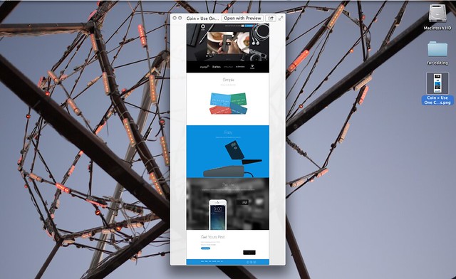
But it hasn’t been all bad. As my personal career shifted from straight-up-old-school newspaper journalism to working with startups in telephony, translation, travel and the web itself. Design became important. And I, we, engaged in politics and social change through software and user-centered design. Bringin it back to the people!

How important will design be when this fantastical iridescent sphere goes pop? Here are a few things that could happen:

The bubble will burst for everyone
Designers, no more or less than engineers, PMs, marketing and sales folks will feel the squeeze. Companies, not individuals will pop with the bubble.

The bubble will burst for designers first
Perception of designers will reshift to be seen as soft roles focused on shadow weights and illustration. The bubble will give up on color theory and not realize they’re losing product strategy.

The bubble will burst for designers later
Companies will hang onto designers as long as they can, but inflated design departments will return to 1-man shops.

The bubble will burst for everyone else
Thanks to companies like Apple, IDEO, Airbnb and Jawbone, design-driven product will remain a priority.

Realistically, all, some and none of these things will happen. But let’s at least engage in the conversation. Are we doing what we came here to do? And how should we think about the future? Sooner or later, Silicon Valley will have to pay attention to the rest of the world.

Categories
Design Journalism

What the New York Times looks like when they build software: a look into their redesign

New York Times Tower - Renzo Piano Building Workshop + FXFOWLE

Today the NYT released their redesign to all employees. It looks very much like their redesign prototype from earlier this year.

I remember when I saw the prototype. “Impressive,” I thought, here’s a company over a century and a half old practicing user-centered design techniques to rethink their site. With a semi-public prototype release, I assumed they were collecting both qualitative and quantitative analytics: user-testing and tracking data. According to Poynter, the public release is expected in “early 2014”.

article_news

According to a news release on Poynter.org, the redesign is available to all employees behind their firewall. However in the message to all employees, the authors wrote:

This employee preview includes nearly all of the same elements found on the article prototype we made available earlier this year, but rendered on an entirely new page serving platform which is both faster and dynamic.

Questions & Critque

This made me question the purpose of the prototype:

  1. Did they collect analytics and feedback on the prototype?
  2. If they did collect analytics on the prototype, why didn’t much change? Was everything perfect the first time? Did they ever intend to make any changes?
  3. Was the prototype a proof of concept for stakeholders?
  4. Was the prototype more of a service for the engineering teams to help understand what to build?
  5. Does the prototype serve to ease the discomfort of those in an industry general adverse to change?

The article pages are beautiful and keep to the spirit of the New York Times publication and brand while bringing it to actual modernity to digital content. I expected to see more change on the homepage: larger images and a layout closer to the modern web and further from 18th-century newspapers.
nyt-new-hp

Accolades

But, what they have done is impressive. This company, a content-not-software, company, mind you had their work cut out for them. They had to update a potentially 8-year-old codebase with conservative stakeholders, draining readership, work with short staffs, all while keeping the 24-hour news cycle moving. Not an easy task.

Activity in the Community

It’s been wonderful to see more news organizations adopting experience and user-centered design tools and techniques. Here are a few other examples from the last few weeks:

Experience Design Adoption

The author in the PBS article refers to prototyping as something “NASA” does for the Mars Rover and people who build software as “Silicon Valley Whiz Kids”.

  • How can we make Experience Design techniques adoptable to those who are not software people?Some argue we should not to keep our jobs in high demand–I disagree. Also check out Jeff Lawson’s talk on Software People.
  • How can news organizations without the resources, but with the desire, of the New York Times, to modernize their newsrooms? Some argue that we should bide our time and let new organizations and media outlets replace the old. However, many out there want to change but are experts in reporting and content, not products development.
Categories
Design

My month on the flexible schedule

troll down 18th street or visit Baker Beach on any day of the week in San Francisco and you’ll find so many people out, you’ll think it’s Saturday. You won’t be the first to wonder if anyone in this city of workaholics is actually working.

I left my full-time job and took an unstructured staycation of exactly one month. I wanted to reconnect with people whom I’d lost touch, spend time writing and reflecting and improve my diet, sleep and exercise routines. My only restrictions were from traveling, shopping and developing new technical skills. Otherwise, life was an open book.

… continue reading on Medium

Categories
Design

My month on the flexible schedule

https://d262ilb51hltx0.cloudfront.net/max/800/0*0TPkoPMQNygqsGl6.jpegStroll down 18th street or visit Baker Beach on any day of the week in San Francisco and you’ll find so many people out, you’ll think it’s Saturday. You won’t be the first to wonder if anyone in this city of workaholics is actually working.

I left my full-time job and took an unstructured staycation of exactly one month. I wanted to reconnect with people whom I’d lost touch, spend time writing and reflecting and improve my diet, sleep and exercise routines. My only restrictions were from traveling, shopping and developing new technical skills. Otherwise, life was an open book.

… continue reading on Medium

Categories
Design Journalism Language London

Guardian Adverts: still brilliant and timeless

London-based Newspaper The Guardian redesigned their print product in 2005. It won multiple awards for its use of the Berliner format along with the ease of readability, consideration of readability, flow from section to section and brilliant use of color, photography, illustration and language.

Later came the website redesign and new advert campaign. I met Creative Director Mark Porter and Special Projects Director Mark Leeds for while in London internship, research and Uni courses. More on that meeting here.

What’s most inspired is how well the redesign and team translated the print vision to their website and marketing campaigns. Nearly 10 years later, their adverts still inspire me:volumecontrolgu81

the-guardian-fact-opinion-small-61493

ownedbynooneeb21

factandopinionex21the-guardian-restraint-small-84267the-guardian-plurality-small-77172

guardian-guardian-opinion-small-89860guardian-guardian-shout-small-47784


Categories
Design

What to do with all your data; talking visualization with Sarah Nahm and Ian Johnson

Good friends Sarah Nahm and Ian Johnson came to visit me at work to talk with the design team about data viz! Read more about it here:

http://pivotallabs.com/what-to-do-with-all-your-data-talking-visualization-with-sarah-nahm-and-ian-johnnson/