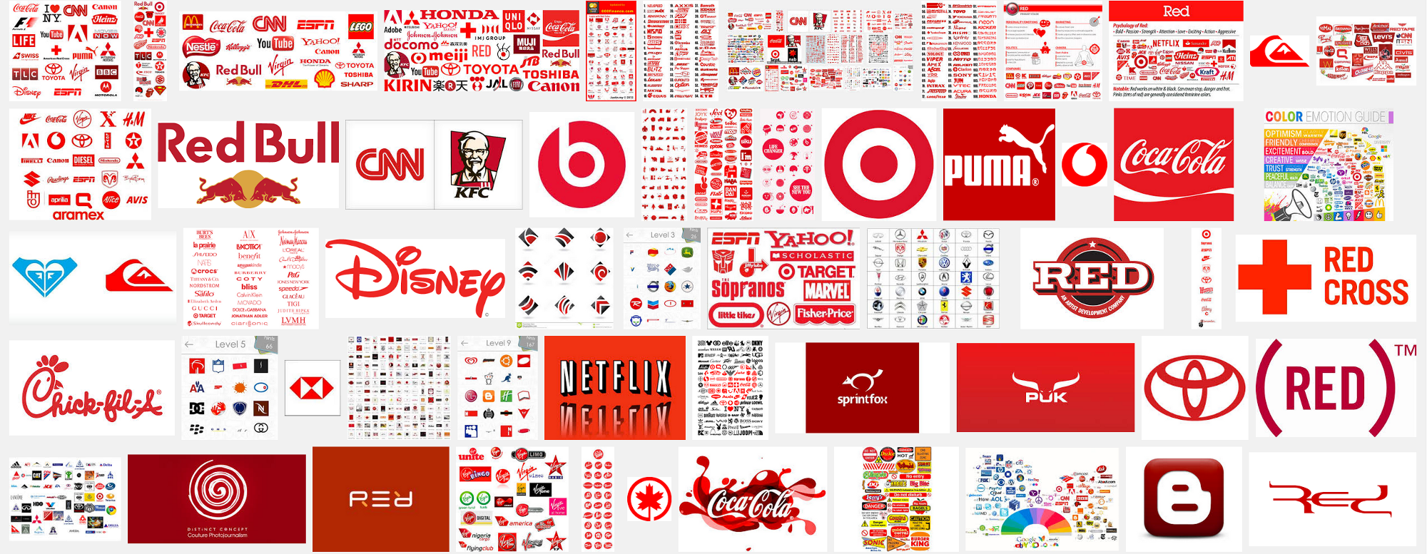
The most evocative, emotional, and intense hue on the spectrum is also the hottest in temperature. It stands out brightest on an interface making this color an attractive option for both logos and error messages. Working with AAA, Macy’s, Toshiba, and Twilio helped me see how users can create anegative association between the brand and making mistakes when both components are red.
I don’t have an easy solution for you. But after dealing with this problem over and over again, I hope this post will help you think more carefully about color, messaging, and placement in a way that fits your brand.